
I’ve been rethinking why we rely so heavily on icons in interfaces.
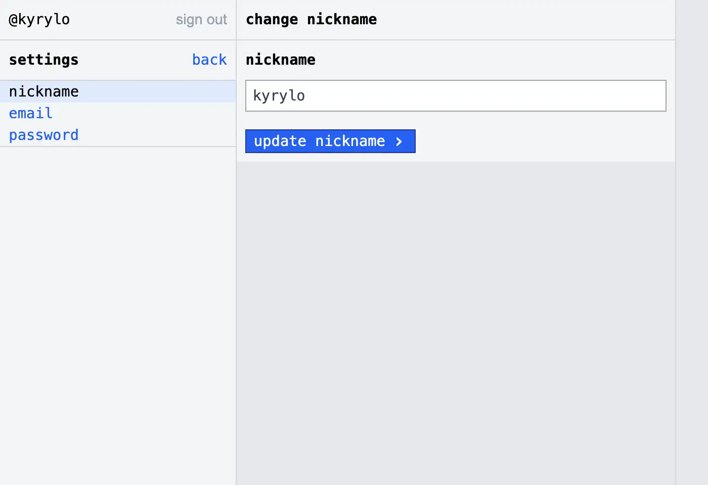
While building a mostly text-based UI for Telesink, something became obvious: icons make things look polished, but they rarely make things clearer.
We tend to treat icons as essential. In reality, they’re situational.
They help when:
- 👍 Multilingual products: not everyone speaks the same language, icons provide rough affordances
- 👍 Space-constrained UIs: when labels don’t fit (mobile, dense tables)
- 👍 Repeated actions: once learned, icons are faster to scan
- 👍 Visual grouping: they help chunk related actions
- 👍 Status & feedback: success, warning, loading are instantly recognizable
But most of the time, they’re not necessary:
- 👎 They have to be learned (many aren’t universal)
- 👎 They’re ambiguous without labels
- 👎 They slow down new users
- 👎 They add visual noise without adding meaning
- 👎 They increase design and consistency overhead
- 👎 Text is more accessible (screen readers, clarity, localization control)
So for Telesink, I chose a mostly text-only interface. Not as a stylistic choice, but a practical one:
- ✅ clearer actions
- ✅ less guesswork
- ✅ faster onboarding
- ✅ simpler to build and maintain
My rule of thumb
Whenever I’m deciding whether to use an icon or text, I now run it through two simple questions:
- Would a first-time user understand this instantly?
- Does the icon truly add clarity, or is it mostly decoration?
If it doesn’t pass both tests with a clear “yes”, I default to text.
This mental filter has dramatically reduced visual clutter and forced me to focus on actual communication rather than aesthetic habit.
Less decoration, more communication.